Overview
The Button Module typically refers to a predefined component or element used in user interface design to prompt users to take a specific action.
Features Included
The Button Module in HubSpot offers beneficial features for your web page to help drive more traffic and offer transparency.
These features include:
- Text: The button usually has concise and action-oriented text that tells the user what action will be taken when they click the button. For example, "Sign Up," "Get Started," "Buy Now," "Download," etc.
- Design and Styling: Button are designed to be attention-grabbing. They often stand out from the rest of the page's content through the use of color, size, typography, and sometimes even animations.
- Button Size: The shape of the button can vary based on the overall design of the interface, but it's usually rectangular or rounded. The size is also chosen to be prominent but not overly intrusive.
- Clickable Area: The button should have a clear clickable area, and users should be able to click it easily with a mouse cursor or a touch on a touchscreen device.
- Responsive Design: Button needs to be designed with responsiveness in mind, ensuring they look and function well on various devices and screen sizes.
- Hover Effects: Some designs incorporate hover effects, where the appearance of the button changes slightly when a user hovers their mouse over it. This provides visual feedback and encourages interaction.
- Customization: Button module can be customized in terms of styling, animations, and behavior.
Module Set up
Setting up the Button Module is easy and straightforward. All you have to do is perform a simple drag and drop.
Now let’s go through the setup steps:
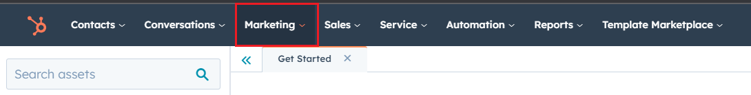
- First, log in to your HubSpot account and navigate to the “Marketing” tab.
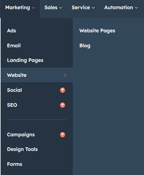
- Click on “Website” in the dropdown menu and select “Website Pages” from the extended menu.
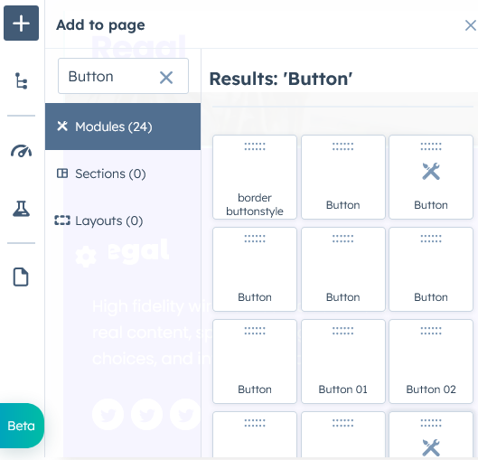
- Select the template and create your web page as usual. Under the module selection menu, search for “Button” and select the module.
Module content
Figure: 1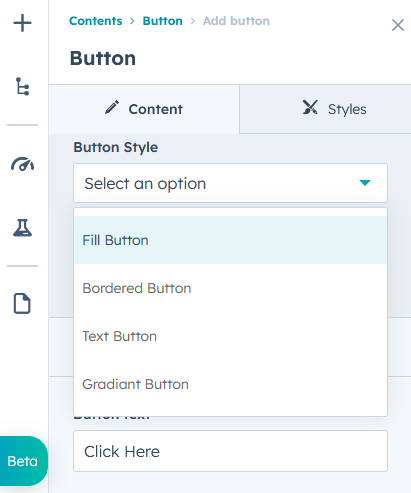
Figure: 2
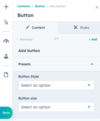
Under “Content”, you can edit the content you want to be displayed on your Button section. Easily adjust and update the “Animation”, “Button Style”, "Button Size", "Button Color", "Button text" and "Button link" as you please.
Module styles
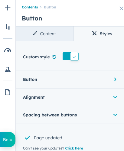
Module can be custom-styled to Button color, font, font-size, transform, bordered and hover effects easily managed.
Support
Revival Pixel Support
For support, please reach out via email to support@revivalpixel.com
We aim to reply within 1 business day.